The Ask
While we were collaborating with our client on a Resource Hub app for busy baristas on the job, our client proposed that in the final design, we should use a bottom rail navigation for the app. This was a new idea to us — up until this point, we had been operating on the assumption that due to platform limitations, we would be using a standard top bar navigation. Our UX team had some concerns about the proposal and wanted to open up a dialog with our client partner about best practices for navigation on a tablet — the device that this application would be used on. I put together a brief presentation on Tablet Navigation best practices that was shared with both our client and our wider UX team to demonstrate the importance of navigation location and function on a tablet, a device that is not often considered or used in mobile applications.
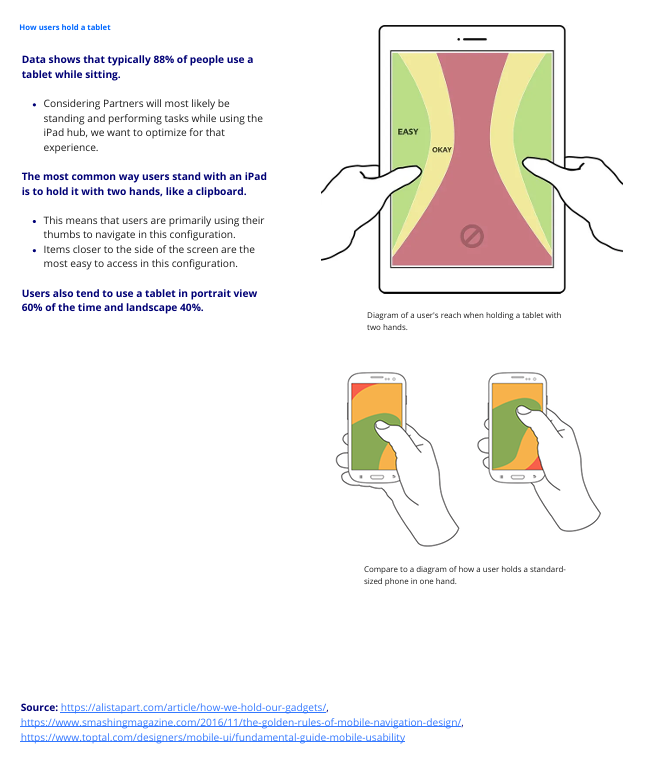
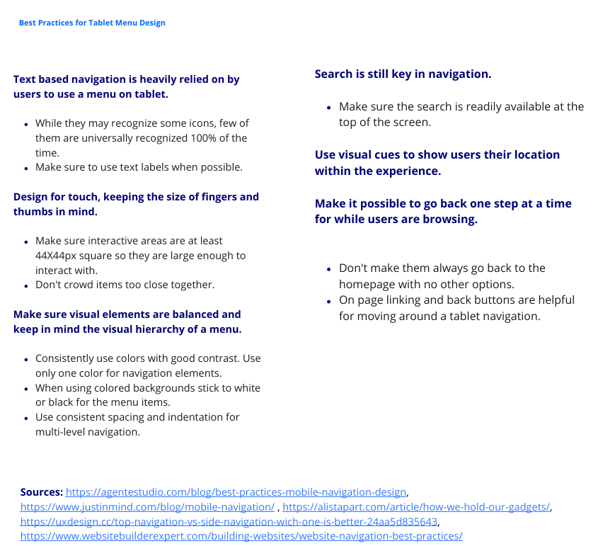
Based on research into navigation best practices and how users generally interact with a tablet, as well as keeping in mind the setting where our app was going to be used (behind the counter at a busy coffee shop chain), I proposed a recommendation of either using the top bar navigation or using a left side rail, both of which had a proven track record on tablet. This recommendation was based on research into tablet usage and our previous user testing sessions that had the top bar.
The Result
Although the client did make the decision to stick with the bottom navigation, they appreciated our insights and recommendations. This ended up forming a stronger collaboration with them by showing our dedication to the project and approaching the recommendation with care and data-backed evidence.
Snippets: